Developer Tab
This tutorial explains the Developer tab in WP-Property Settings. The Developer tab is the most important tab of all. You can create custom Attributes and Property types. You can also edit existing property attributes such as Price or Bedrooms. You will find settings that let you select sorting and search options plus specify which attributes will be hidden from view.
It has list of attributes, that can be added, replaced by simple dragging, changed and deleted.
You can add any amount of your custom attributes, meta attributes, property types and other taxonomies such community features.
Attribute settings consist:
- Sortable - Makes attribute sortable using [property_overview] shortcode.
-
Searchable - Makes attribute searchable using property search widgets and [property_search] shortcode.
-
Admin only - Makes attribute invisible on frond-end. Please, make sure, that any attributes, that are used on front-end(used by Google Validator and Address Display, used for images displaying, etc.) are not checked as “Admin only.”
- Show on “All Properties” table - Adds the field as a column to the “All Properties” table.
Search Input
Search input field helps you set attribute visualization in property search widgets and when you use [property_search] shortcode.
Search Input Fields showcase
- Free text
- Text input range (Only for numeric attributes)
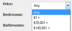
- Range Dropdown (Only for numeric attributes)
- Advanced Range Dropdown (Only for numeric attributes. Provide list of values separated by comma.)
- DropDown Selection. (Provide list of values separated by comma. You can leave provided box empty and it will be populated with all existing values from this attribute.)
- Single Checkbox
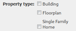
- Multi-Checkbox (Provide list of values separated by comma)
Data Entry
Data Entry field can set attribute entry visualisation
Data Entry Fields description
- Free Text - for attributes with small amount of text.
- Textarea - a multi-line text input.
- Text Editor - a multi-line text input with ability to style the text.
- Dropdown Selcetion - is used to create a drop-down list. Specify you list of attributes separated by comma in the spacial box which you will see after you chose that type.
- Advanced DropDown - is used to create a drop-down list. Has ability to search within attributes while adding. Specify you list of attributes separated by comma in the spacial box which you will see after you chose that type.
- Single Checkbox - is used for boolean attributes with value yes or no(false or true).
- Multi Checkbox - are used for instances where a user may wish to select multiple options.
- Radio - for selecting one of many choices.
- Number - for numeric attributes.
- Currency - only for numeric attributes. Will add currency symbol to the value of attribute.
- URL - will show clickable link.
- Oembed - used to embed a video or another object. A protocol for site A (such as your blog) to ask site B (such as YouTube) for the HTML needed to embed content from site B.
- Date and time picker - allows the user to select date and time (no time zone)
- Date picker - is used for input fields that should contain a date.
- Time picker - allows the user to select a time (no time zone).
- Color picker - for choosing colors of your attributes. Will display color code.
- Images Upload - allow to upload images to the property. Do not have frontend view.
- Files Upload - allow to upload files to the property. Do not have frontend view.
- File URL - show link to file from your site.
Backend filters on All Properties page
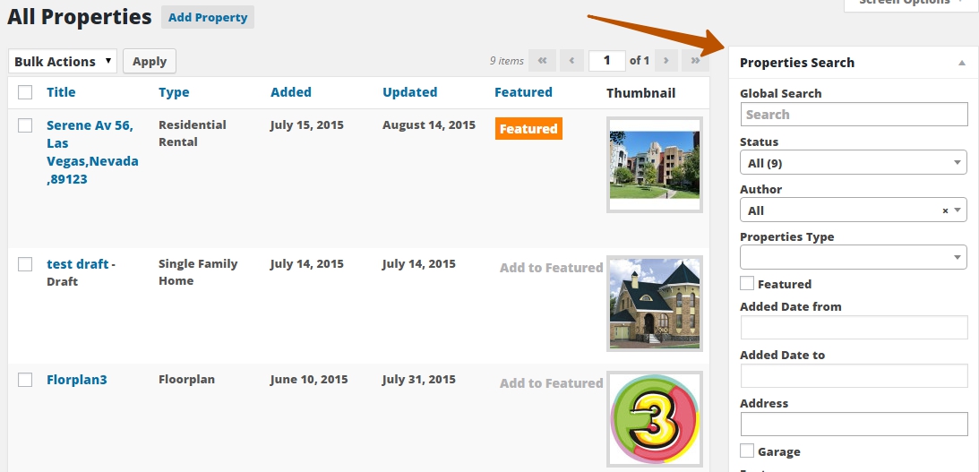
To show attributes filters on ‘All Properties’ page you should set valid “Data Entry” and “Search Input” for attribute. Also, attribute should be searchable.
For example:
Price should have Data Entry ‘Numeric’ or ‘Currency’ and Search Input could be one of the following types:
- Free text
- Text input Range
- Range Dropdown
- Advanced Range Dropdown
- Dropdown Selection
Filter on All Properties page supports only following fields:
- DropDown box
- Multi Checkbox
- Input
- Checkbox
Here is the following map between Search Input and Filter fieds:
- Free text - Input
- Text input Range - DropDown box
- Range Dropdown - DropDown box
- Dropdown Selection - DropDown box
- Advanced Range Dropdown( available from WP-Property 2.0.2 ) - DropDown box
- Multi-checkbox - Multi Checkbox
- Checkbox - Checkbox.
Group Picking
Group Picking Color function allows to pain attributes in different colors for more convenience and group them by clicking on “Sort Stats by Groups” button in upper right corner of Attributes table and to select main group. To see that table just click on opposite attribute field in “Group” column.
Geolocation attributes
Some attributes is used by Google Validator and Address Display functionality. They are set automatically and can not be edited on Property Editing/Updating pages. Here is the list of such attributes:
‘formatted_address’, ‘street_number’, ‘route’, ‘district’, ‘city’, ‘county’, ‘state’,
‘state_code’, ‘country’, ‘country_code’, ‘postal_code’
Meta attributes
Meta attributes are used for descriptions, on the back-end meta fields will be displayed as text areas. On the front-end they will be displayed as individual sections.

Property Type Settings
Add and set up your own property types in this tab
Settings consists:
- Searchable - allows to use that property type in search widgets and with using [property_search] shortcode and Location Matters.
- Location Matters - show property type marker on the map.
- Hidden Attributes - helps to hide any of that property type attribute.
-
Inherit from Parent - regulates what attributes child properties inherit from parent property.
- Map Marker function(Supermap Add-on) allows to set property type map marker instead of default Google map marker.
If you want to customize Property Type, you can add it to Property Attribute tab and change it’s tittle, use it in searching and sorting.


